
The National Dashboard and Human Progress

In this post, I aim to consider a hypothetical national dashboard comprising essential metrics that measure the economy, human well-being, and long-term progress. It is hypothetical because, although all these metrics are measured today, not all of them receive equal attention in the government and the media.
In This Post
Show Me the Numbers
Can We Measure Progress?
A National Dashboard
Upstream Drivers of Long-Term Progress
A Possible Set of 11 Metrics
More Options
Global Focus
Show Me the Numbers
As someone who has studied economics and business and spent over a decade working in the private sector, I’ve been long dismayed by how little focus there is on numbers in government and media reporting. To the extent politicians focus on numbers, they typically pick the ones that support their narrative and seem relevant to this week’s news cycle.¹
I wonder if there’s a better way. What if we reversed the order? What if we came together as a society and determined (1) what areas we would most like to improve, (2) the best way to measure the progress, and (3) the best way to report on it and future plans? What if we then used this framework to guide public conversation, media reporting, and perhaps even some White House press briefings?
The idea is not new, of course. And many people have already tried to popularize it. Recently, Andrew Young got many people excited when he proposed the idea of the American scorecard and — taking the idea to the extreme — suggested that the president use PowerPoint to report on progress.
So what’s the problem?
The problem isn’t as much that we aren’t measuring things.² The problem is threefold:
There is little national and global public consensus regarding which indicators matter most.
There is limited accountability when it comes to improving these numbers and publicly reporting on them in a structured way and with a regular cadence.
Media focus can sometimes be misplaced, haphazard, pessimistically biased, localist, and short-term focused.
Can We Measure Progress?
First, we might want to agree on what human progress is. And since this conversation can get rather complicated and heated quickly, it might make sense to focus on things things that people universally value. Here is a relevant quote from Steven Pinker’s Enlightenment Now:
“What is progress? You might think that the question is so subjective and culturally relative as to be forever unanswerable. In fact, it’s one of the easier questions to answer. Most people agree that life is better than death. Health is better than sickness. Sustenance is better than hunger. Abundance is better than poverty. Peace is better than war. Safety is better than danger. Freedom is better than tyranny. Equal rights are better than bigotry and discrimination. Literacy is better than illiteracy. Knowledge is better than ignorance. Intelligence is better than dull-wittedness. Happiness is better than misery. Opportunities to enjoy family, friends, culture, and nature are better than drudgery and monotony. All these things can be measured. If they have increased over time, that is progress.”
It’s true that “not everything that counts can be counted, and not everything that can be counted counts”. But we can still count most things that matter.
A National Dashboard
Imagine a regularly updated dashboard that shows 10 to 20 metrics that are widely viewed as important:
Click on a metric and see the latest plan — a one-pager updated quarterly and aimed at improving the metric in the 1-year to 5-year horizon.
Click on “previous plan” to see how well the plan from the last quarter worked — a one-page post-mortem.
Ask yourself if the new plan is better.
Submit your questions and upvote others’.
Then hear the answers in the next live-streamed 30-min structured presentation and 30-min Q&A where questions with the highest number of upvotes minus downvotes get answered first.
I think for the idea to gain wide adoption in a given country, people would need to collectively answer several questions. When there’s consensus, there’s a chance to create accountability.
Here are just a few to ponder:
Metrics. What should we track?
What matters most at the national level?
What can be measured well and is hard to manipulate?
How can the full set of metrics balance individual ones out?
Can we track leading indicators as well as lagging indicators?
What metrics are so straightforward that everyone can understand them?
What incentives will be strengthened and weakened if we focus on these metrics — including perverse incentives?
Timeframe. What’s the right frequency and meaningful timeframe?
Accountability. Who should be accountable, who should present, how detailed should the presented vs. published plans be, etc.
Upstream Drivers of Long-Term Progress
One danger of looking at lagging indicators only is that they might not be actionable. And we might not take action necessary to ensure long-term progress. So we should also be asking ourselves what upstream drivers of progress are. In other words, we should consider leading indicators as well.
What drives human progress is a matter of ongoing debate, but let’s assume that the following three are at least a major part of the picture:
Universal global access to education and opportunity.
Fundamental research in universities and labs: theoretical physics, etc.
Real-life application and distribution of new technologies: new startup creation, engineering, corporate R&D, etc.
These three create a strong virtuous circle. More talented people → more foundational knowledge → more prosperity.
With all that in mind, I decided to do a fun thought exercise and come up with a possible set of metrics that could capture how we’re doing at the national level.
A Possible Set of 11 Metrics
Economy:
GDP (PPP) per capita growth
Growth in median net disposable income
Growth in median net worth
Well-being:
Median life expectancy and healthy life expectancy
Subjective life evaluation (aka happiness)
Depression rates
Crime rate
Suicide rates
Long-term/leading indicators:
Education quality
Funding of fundamental research
New business creation
For each metric report on:
How has the metric changed over time?
Where do we stand in the global ranking today?
How has our position changed over time?
So what could this hypothetical dashboard look like for the US in 2021? Let’s take a snapshot of these metrics.
Economy
1. GDP (PPP) per Capita Growth

Source: Worldbank.org
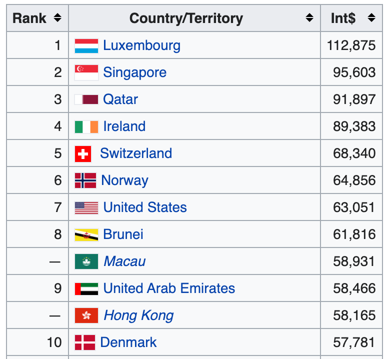
Source: International Monetary Fund, 2020
The GDP metric has many problems. Not all goods and services are equally valuable to humankind. However, it can be a good proxy and starting point. We know that growth, in itself, has been historically important for getting people out of the zero-sum game mindset. There have also been multiple attempts to account for the limitations of this metric.
2. Growth in Median Net Disposable Income (Accounting for Debt, Rent, and Healthcare?)
Looking at median numbers should help us partially account for inequality.

Source: OECD Statistics
An important question here is what constitutes “net”. What should we adjust for? For example, should we account for debt, rent, and healthcare?
If we want to create the right incentives to increase everyone’s prosperity, should we subtract rent payments, loan payments, and healthcare expenditures — given how much is spent on these three and given the differences among countries?
In other words, does a person who earns a post-tax income of $100K but spends $80 on rent, student loan payments, health insurance, and medical bills, really have $100K in disposable income?
Continue reading on Max's Two Cents:
9 more dashboard metrics
Additional options
Global focus
Discussion
If you like my articles, please consider signing up for radically infrequent email updates. And say hi on Twitter! 👋